This week, we spent a lot of time shaping JAICE’s look and overall vibe, while also locking in some big development decisions. We kicked things off by putting together our design document and style tile, basically a snapshot of the colors, typefaces, and mood we want the app to have.
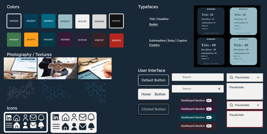
One of the first calls we had to make was our tech stack and the general “feel” of the app. After tossing around a bunch of ideas, we landed on a dark theme with cool blues. Most tech apps lean toward cool tones, and we like how a darker palette is easier on the eyes, especially for users who might be staring at their job applications for a while. Plus, it just looks sleek and professional. I even added a peek at our style tile so you can see where we are headed.
With the visuals coming together, we also finalized the must-have features for our first release. Now we know exactly what JAICE needs to do on day one and what can wait for a future update.
Design work kept rolling, too. I worked on the color palette, explored typefaces, and helped pin down an icon style to keep everything consistent. We mapped out some key layout choices, focusing on the dashboard, which will be the core of the user experience.
On the technical side, we discussed the dataset that will power JAICE’s AI features to keep our recommendations accurate and helpful. And of course, we couldn’t resist brainstorming a few version 2.0 ideas for after graduation.
All in all, it was a productive week that gave JAICE a clear identity and set us up for prototyping and getting our workflow in place.
