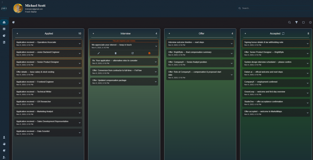
This week, I focused on improving the client-side experience for emails marked as “Needs Review.” These are the emails that the classification model was not fully confident about, so now they stand out visually. I added an orange outline around them and hover text that explains what the user should do. Each of these emails also has a “Mark as Reviewed” button that, once clicked it updates the database (changing the value from true to false), removes the outline, and hides the button.
I also added color outlines for some of the emails. Accepted emails now have a green outline, while rejected ones have a red outline, giving users an easy way to scan their status at a glance. Since there was no good spot for rejected emails before, I built a toggle button at the top of the Accepted column. This button lets users flip the column view between Accepted and Rejected emails. It keeps the interface clean and avoids cluttering the dashboard with too many columns.
Next week, I plan to focus on smaller but important features that will continue to tie everything together. My main goal is to add an “Add Card” button so users can manually add applications they might not have gotten emails for, like ones they applied to in person. I will also be fixing a few bugs that came up this week to keep bugs from adding up before user testing next month.